The Making of the Kremer Pigmente Series: Risk and the Paradox of Digital and Analogue Painting
by: Barbara Bolt , May 15, 2019
by: Barbara Bolt , May 15, 2019
Introduction
This visual essay is concerned with risks and paradoxes in analogue and digital painting, testing the mediums of watercolour and the digital painting program, Brushes Redux. I began the process with the acquisition of fourteen watercolour pans of pigment at the Kremer Pigmente shop in Munich and then rendered them as digital and watercolour paintings. Here, I trace a reflexive process in which the pans are used—first in digital and then in watercolour painting—to reveal the affordances that the two different mediums offer in our increasingly digital world.
Through the process, I have identified a paradox. While watercolour may appear open and fluid and the digital paintings seem to have a sense of closure and completeness, it is, in fact, the digital that provides the conditions for material mutability. In the digital painting program, the undo and redo buttons allow for continual correction. The copy function enables iterability and the digital nature of an image allows for it to be multiplied and transmitted ad-infinitum. Paradoxically, the mutability of the watercolour sits in the mind’s eye of the viewer, her capacity to imagine. The watercolour is only virtually mutable. This opens up a question for the new materialist: what is the relationship between the virtual and the mutable, the imagination and the material?
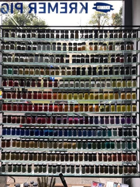
Fig. 1 Kremer Pigmente Shop, Munich
Part I: The Digital Painting
I have now completed digital paintings of the fourteen pans of Kremer watercolour pigments, which I bought from Kremer Pigmente shop in Munich on 11 August 2018. I worked with Brushes Redux, a painting program that is now quite old and has not been updated since 2012. Although that makes it a dinosaur in digital terms, it suited my way of working.
I did not take notes during the process of making the digital paintings, working rather intuitively through the series. Having spent several weeks on the project, I slowed down and pondered on the process while making a final digital painting of a pan of watercolour pigment, allowing time for reflection and documenting the process, if you will.
It was not a Kramer pigment I was working with here in this rear-view onto the series of digital paintings. This last reflective making involved Schmincke Horadam cadmium orange aquarelle bought at Boesner’s art shop in Berlin. This brought the total number of paintings to fifteen. The Hoaradam aquarelle pan had a totally different quality than the Kremer pigments—much more plastic in appearance than the graininess of the Kremer pigments. Nonetheless, it was useful to take process captures during the making. I had the whole process documented but here I only include a few of the images to give a sense of a trajectory of the painting and the visual decisions I made. At this stage, I was preparing to start working with watercolours and again document the process—a much riskier and immediate endeavour, with no redo button at hand.
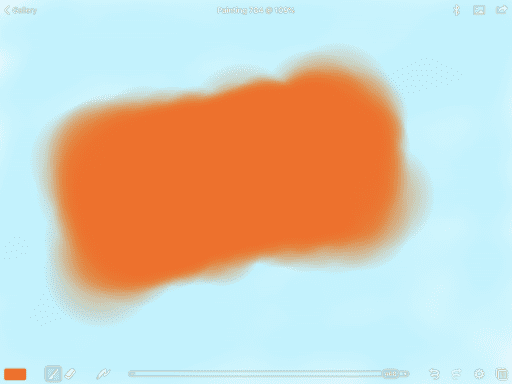
Fig 2. Process of making an orange lozenge
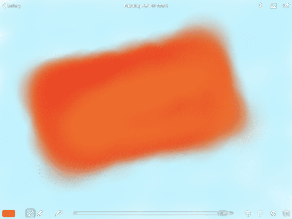
Fig. 3 Process of making an orange lozenge
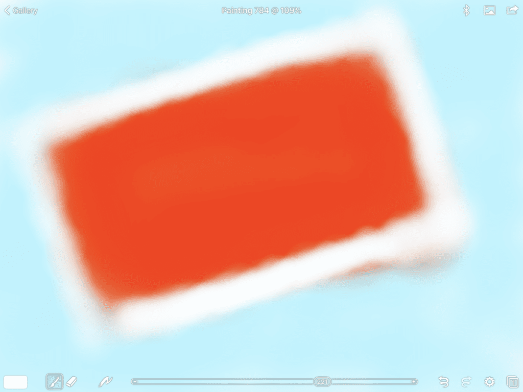
Fig. 4 Process of making an orange lozenge
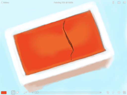
Fig. 5 Process of making an orange lozenge
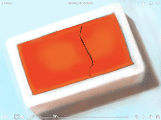
Fig. 6 Process of making an orange lozenge
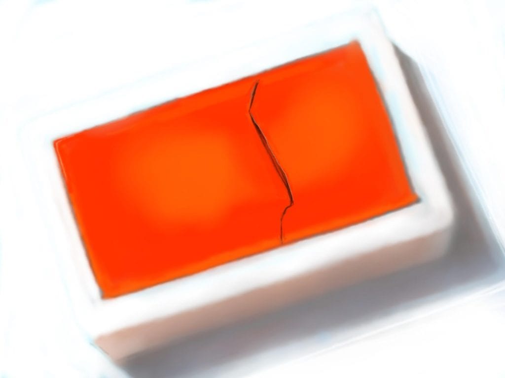
Fig. 7 Process of making an orange lozenge
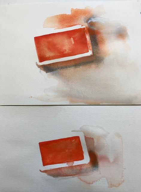
Fig. 8 Working drawing, watercolour
Of the fourteen digital paintings of the watercolour pigments bought at Kremer Pigmente, most have been made in daylight. Despite this, I lit the pans of pigments with a lamp fitted with a halogen globe. The combination of natural and artificial light affected the depth and the complexity of the shadows, as well as the nature and intensity of the hues shining out of the pans. The light from the window during the day brought a strong high-key blue into the shadows. This only disappeared when the daylight faded, and the pans became solely bathed in halogen light.
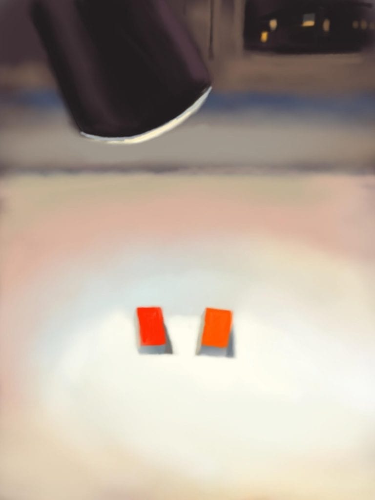
Fig. 9 Watercolour pans bathed in halogen light.
The digital paintings began with a simple routine. I lay down a swatch of colour of full intensity—a broad brush sweep of the hue that most closely approximated the hue in the pan in front of me. In some of the paintings, I began with a broad brush of a complementary hue at low intensity so that it was transparent, allowing the white of the screen to shimmer through. I then lay down a broad swatch of colour. At the tremulous edges, where the two hues mixed together a chromatic grey emerged. This indeterminate area or zone of colour often formed the ‘edge’, where the paint met the edge of the pan. The zone where two different colours came together was not a bleed of watercolour—that uncontrollable flow where one wet area bleeds into another creating a third colour that allows both colours to show themselves—but rather a blend. It looked more like an indefinable blur or shimmer than the bleed that characterises watercolour.
At that stage, questions of dimension came into play, of establishing the approximate proportions of the lozenge of colour and laying in the tonal or hue variations that would reflect the way the light interacted with the hue of the pigment in the pan. No hue appeared pure. There were many different hues, tones and shades in each pan of watercolour—sometimes they were just tonal but more often matching hues—warmer and cooler, and sometimes even similar hues appeared on the surface of the pigment.
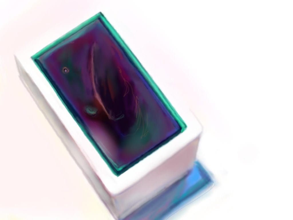
Fig. 10 Heliogen Green, Digital Painting
From the initial mapping of the paint-filled pan, the painting took a course of its own. Sometimes I brought in a perimeter of dark paint—usually but not always the complementary colour since it was never just darker. The brush now was much finer, though still open enough to allow a blurry line rather than a hard one. All these decisions—a hard edge or soft edge, tint or tone, transparency or opacity—came from my training in analogue painting and extensive learning about colour and drawing. I did not try to use many different brushes available in Brushes Redux but rather worked with the intensity of the hue—its transparency and opacity. The working was rapid and undertaken without too much conscious thought. I was responding to what was happening in the work rather than getting bogged down in thinking. The ‘perimeter’ was definitely not an outline but a transitional zone against which decisions could be made about edges, hue and tonal value, hard edges or soft edges, and it set in process the relationship between the colour, the edges of the pan, the thrown shadows and the ground upon which the pan sat. Reality and representation become blurred. And then there was the shadow.
The shadow was never merely just that. It was not black or brown, nor was it solid. Shadows created forms. They were full of colour bringing together a complex and subtle mix of different hues—from warm to cool with complex relations of tones as light was reflected up into the shadow and onto the sides of the pans—cool colours, analogous colours and shadows filled with the light from elsewhere; for example, the blue of the sky, the warm colours of flesh from bodies, or from other objects nearby. These adjacent bodies somehow got caught up in the umbral and penumbral shadows that emerged. All of these subtle colour and tonal relations transformed the lozenge of colour into a form that created an illusion of a three-dimensional object.
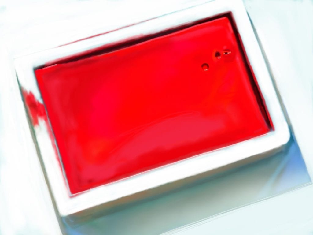
Fig. 11 Cadmium Red Light No. 1, Digital Painting
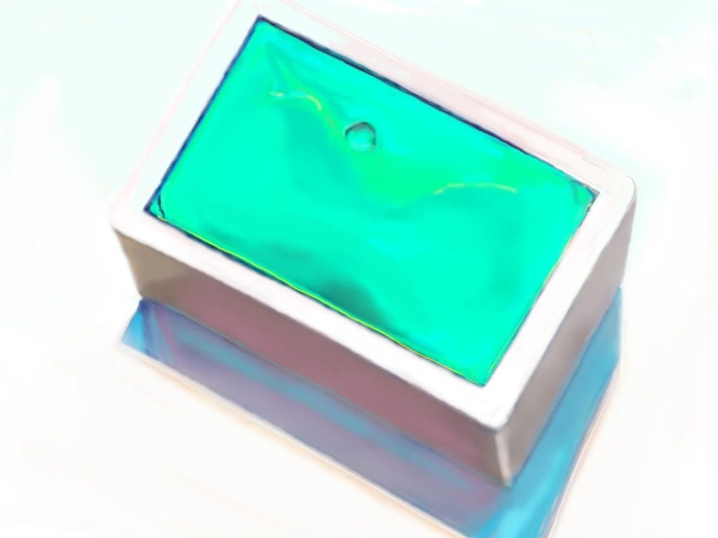
Fig.12 Coni Green, Digital Painting
For the digital paintings, I used a 10.5 inch iPad Pro. It had a small screen, and without a monitor or keen eyesight, I relied on the zoom function. This allowed me to zoom in and out—in for detailed work and out to see the whole picture—much like walking back and forth from an easel, but there was no physical movement of stepping back and forth. Sometimes, I reduced the size of an image to be able to make a linear mark in one move, a bodily move rather than a hand move. And, it was in that physical movement that a glitch was revealed, the program could not cope with the speed of the finger across the surface, and it broke. In every painting, there was a glitch, sometimes evident, and sometimes it almost disappeared as I proceeded.
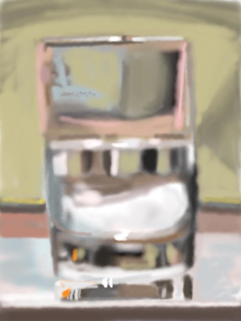
Fig. 13 Barbara Bolt The Glitch, iPad digital painting, dimensions variable
There is no end to the digital painting. Here-in lies the paradox. While each digital painting appears to have reached stasis, a sense of closure, each image, in fact, remains mutable. Here, the undo and redo buttons allow for continual correction, the copy function permits iteration and reiteration. The digital nature of the image allows for multiplying and transmitting ad-infinitum. If a section is overpainted, or other problems emerge in the process, the undo button can resolve the problem, or not. This is the digital image’s strength, but it is also its weakness. It weakens resolve, as the redo button allows for repetition. There is neither an aura of an original, nor re-presentation; only presentation.
Part II: The Watercolours
The task of making the watercolours after the digital paintings called for a different way of thinking and working. Making a watercolour always involves mental, emotional and physical effort. For me, the start involved overcoming the inertia of fear—the fear of a white page, the fluidity of the paint. I knew I could not backtrack once I started. Working with watercolour does not involve mastery over the watercolour but rather skills with the affordances that the medium and its support, the watercolour paper offer in the context of making, rendering, or picturing. Thus, making a watercolour painting calls for the artist to be sensitive to the potential of the medium, allowing the medium to speak for itself. But, perhaps I should not overstate the difference with the digital. My role as an artist is to respond to the affordances offered by the medium, be it the digital or the actual pigment, and enable its character to emerge in its own way. Watercolour has its own affordances and limitations that differentiate it from the digital; there is no undo or redo button, no copy function and no reproducibility. Any re-presentation is a re-presentation of a watercolour—a virtual relation, whereas the digital is always already presentational.
There was much tension at the beginning of this part of the project: The empty page, the quality and weight of the watercolour paper (350 gm hot pressed or 450 gram cold press Hahnemühle watercolour paper), the permanence of the pigment stain, and the need to let the watercolour be in its own nature were all factors at play. Added to this, I would be using the actual pigment from the pans of watercolours that I was painting. It meant that the pans of watercolour were no longer stable objects to be rendered. They were in transformation. All fissures, cracking and pockmarks from the pigment solidified in the pans, disappeared in the process of making, and I was left with a fluid medium. It was this fluidity that I wanted to emphasise—the flows and eddies became central to the character of watercolour.
Problem No. 1: The containers were for all intents and purposes white. While in digital painting, oil or acrylic, the white could be brought in after and over colour, in watercolour, the ‘white’ of the paper had to be left. It could never be regained.
Problem No. 2: I did not want to use drawing to start the works. I wanted just to work with the brush, the paper and my hand gesture. This openness introduced greater imprecision and additional risks into the process.
The early works were clumsy as they always are. Each pan was rendered from a viewpoint directly above. Visible through the introduction of nebulous washes of colour, the pan defined the perimeter and shadows and created a sense of form. I wanted to pour the pigment into the pans and allow it to settle just as Kremer Pigmente poured the pigment into the pans originally. My first renderings did not give this effect, and I remained dissatisfied with the way the rendered shadows distracted from the purity of the pigment, so I started again. This time I simplified the process and focused on the lozenge of colour, which was the pan of coloured pigment. I allowed the pigment to flow out to form. A very simple lozenge of colour defined by itself, one that encompassed the flows and poolings that were so characteristic of watercolour in itself: complete and incomplete at the same time. I concluded the series by painting the paint box filled with its pans of paint.
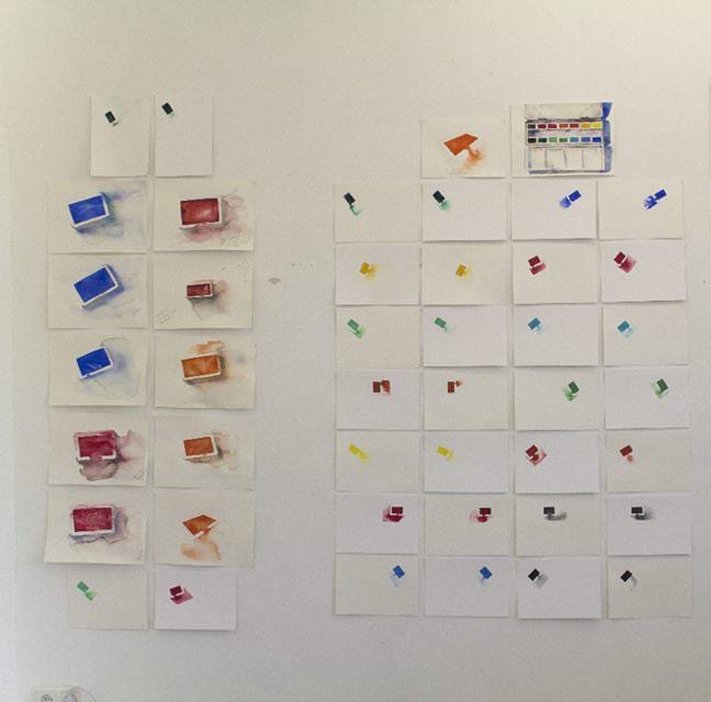
Fig. 14 Watercolour trials, photography Arial Hassan
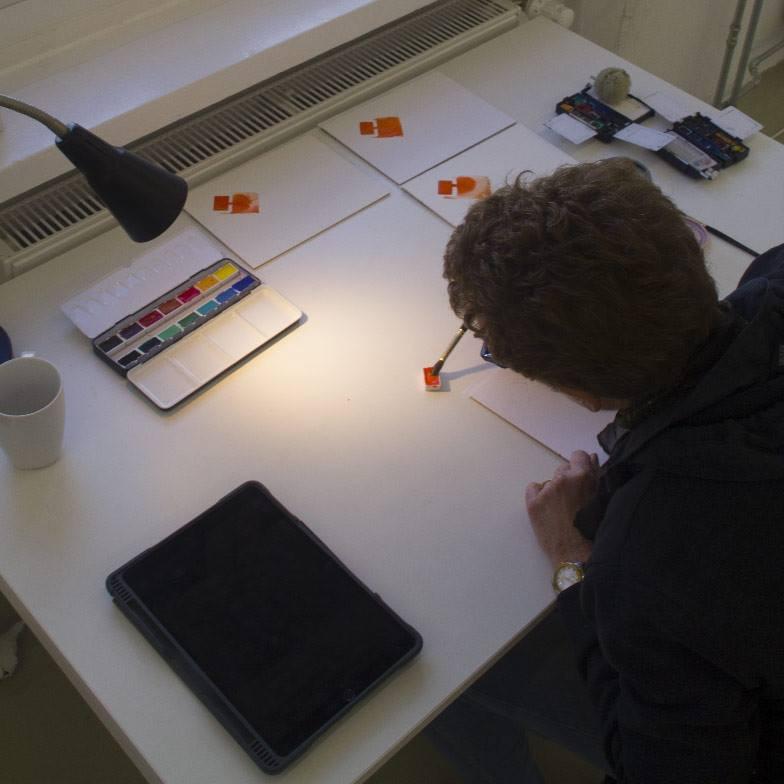
Fig. 15 Watercolour rendering, photography Arial Hassan
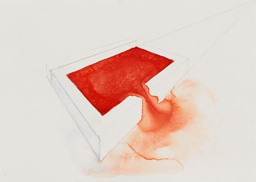
Fig. 16 Barbara Bolt, Cadmium Orange, 2018, watercolour on Hahnemuhle Cornwall, 300gms, photography Christo Crocker
Fig.17 Watercolour rendering, photography Arial Hassan
Conclusion
The two series of paintings—fifteen digital paintings, fifteen watercolour paintings, and a watercolour of a paintbox full of palettes of pigment tell a story about the paradox that relates to the affordances and limitations of two mediums—digital and watercolour. While watercolour may appear open and fluid and the digital paintings seem to have a sense of closure and completeness, technically it is the digital that provides the conditions for material mutability. In the digital painting program, the undo and redo buttons, the copy function and the digital nature of transmission keep the picturing in circulation as mutable. On the other hand, the watercolour is in itself an immutable object. Its representations (photographs, scans, etc.) can never be the thing in itself. As I stated at the beginning of this essay, paradoxically, the mutability of the watercolour is in the mind’s eye of the viewer, her capacity to imagine. It is only virtually mutable. This opens up a further question for the new materialist: what is the relationship between the virtual and the mutable, the imagination and the material?

WHO SUPPORTS US
The team of MAI supporters and contributors is always expanding. We’re honoured to have a specialist collective of editors, whose enthusiasm & talent gave birth to MAI.
However, to turn our MAI dream into reality, we also relied on assistance from high-quality experts in web design, development and photography. Here we’d like to acknowledge their hard work and commitment to the feminist cause. Our feminist ‘thank you’ goes to:
Dots+Circles – a digital agency determined to make a difference, who’ve designed and built our MAI website. Their continuous support became a digital catalyst to our idealistic project.
Guy Martin – an award-winning and widely published British photographer who’s kindly agreed to share his images with our readers
Chandler Jernigan – a talented young American photographer whose portraits hugely enriched the visuals of MAI website
Matt Gillespie – a gifted professional British photographer who with no hesitation gave us permission to use some of his work
Julia Carbonell – an emerging Spanish photographer whose sharp outlook at contemporary women grasped our feminist attention
Ana Pedreira – a self-taught Portuguese photographer whose imagery from women protests beams with feminist aura
And other photographers whose images have been reproduced here: Cezanne Ali, Les Anderson, Mike Wilson, Annie Spratt, Cristian Newman, Peter Hershey